Project Image

Accessing CAPS: Onboarding Form Redesign

Course: Interaction Design and Urban Experiences

Professor: Matthew Wizinsky

Teammates: Katherine Cafaro, Ethan Casler

Responsibilities:

  • Design auto ethnography methods such as surveys and host student and expert interviews
  • Redesign the user flow and the interface of the CAPS Initial Consultation form
  • Conduct multiple rounds of user testings to spot obstacles and refine the process

Skills and tools:

  • Auto ethnography application
  • IxD and user experience research
  • Figma, Adobe Creative Suite

Design process guideline: The double diamond of design (which is shown below)


This project is a surgical user experience redesign for CAPS at U of M under various technical constraints as an attempt to reduce drop-off rates of the CAPS Initial Consultation Form.

Step 1: Discover


During the topic discovery stage of the project, we aim to find an interactive system for accessing and using public services or spaces that has space for improvement. To determine the specific interface for improvement, we used the following methods:

  • Secondary research: We broadly searched for resources online for news articles, citizen complaints, and research reports.
  • Preliminary ethnography: We used the service and asked questions to other users about the accessibility of the system.

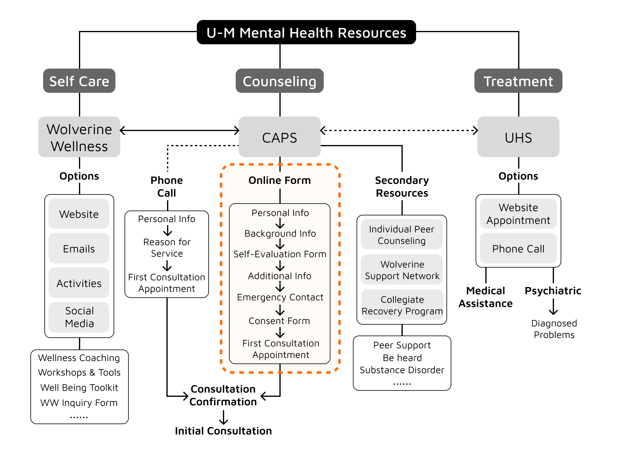
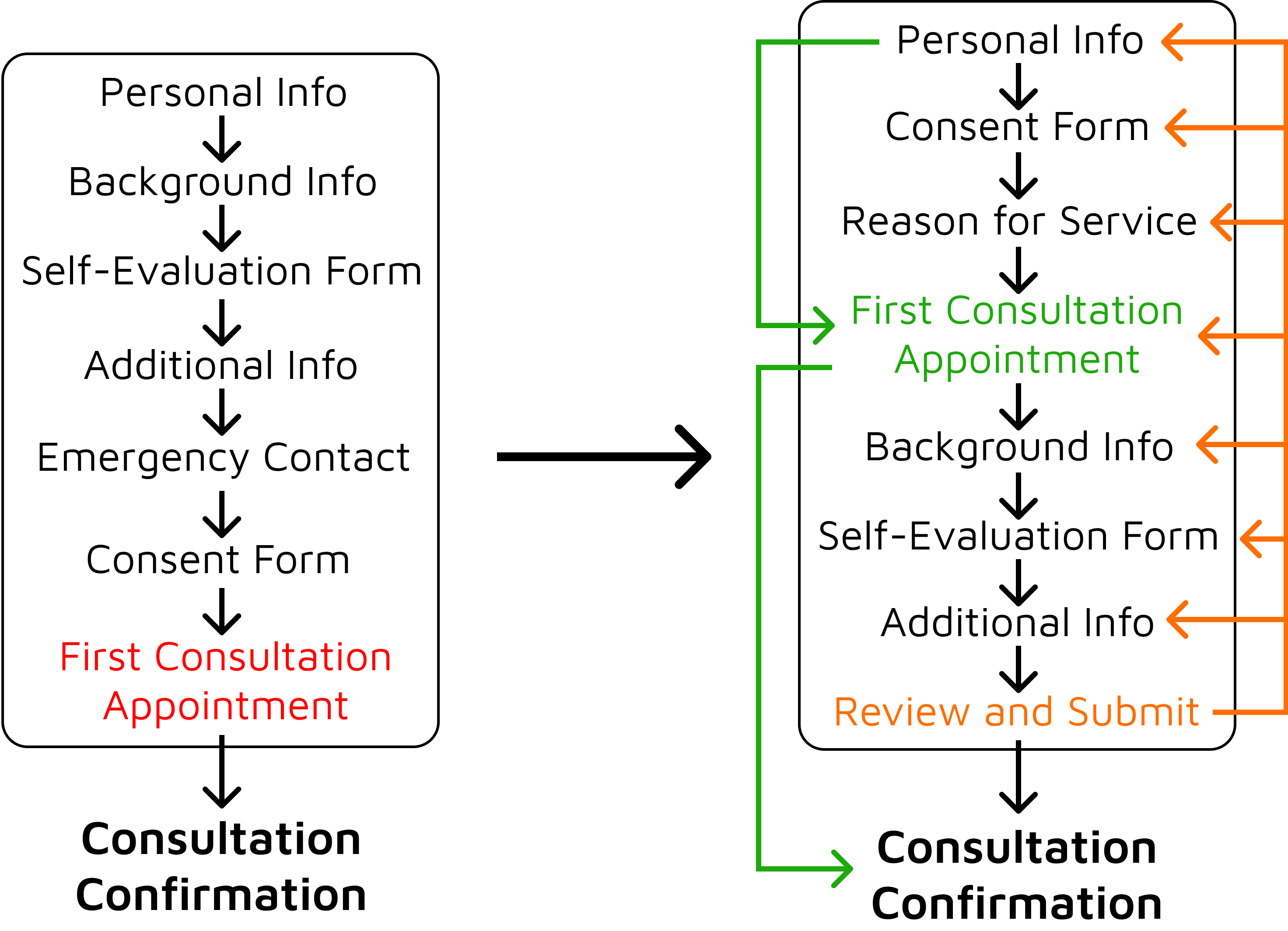
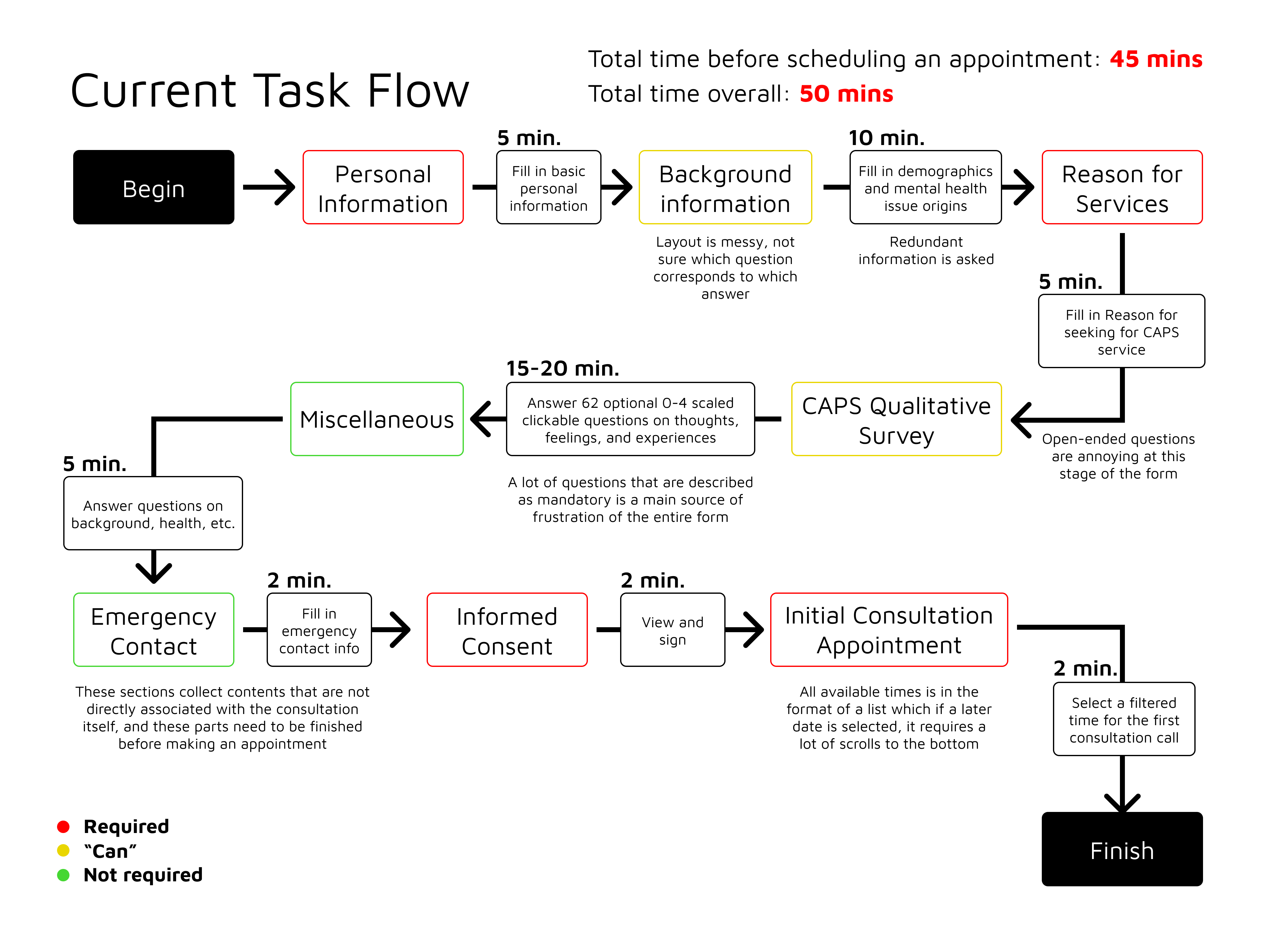
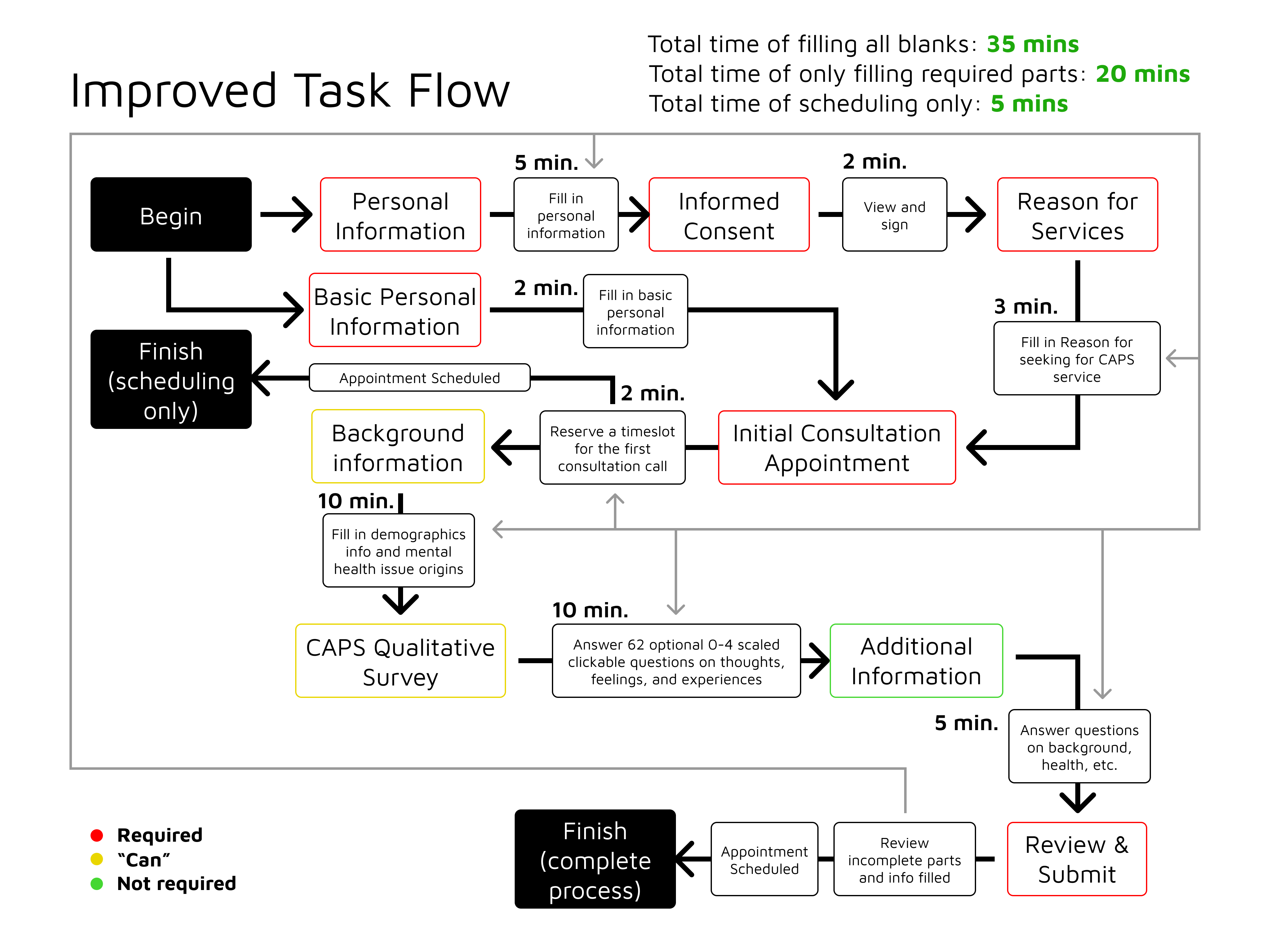
Eventually, we determined the domain of interactive system to improve - Counseling and Psychological Services (CAPS) Service at U of M, a system that offers clinical services to students like mental health therapy free of cost. However, the current system can be a time-consuming and confusing process for students learning about and navigating the resources on campus, further demotivating students from securing the care that they need.

Survey Data from CAPS 2022-23 Annual Report - % of Reasons for Seeking Help

So we determined our initial research question as:

How might we improve U-M students' ability to navigate and access services provided by CAPS and other forms of mental health care on U-M campus?


Then, we carried out some exploratory research to know more about the target population and the interactive system that we are working on.

  • Autoethnography: Each of us have experiences with accessing and engaging with CAPS.
  • 3 expert interviews
    • Dr Chris Frank, medical director of UHS (University Health Service)
    • Joe Zichi, Well-Being Collective Lead
    • Dr. James P. Dolan, Jr., Associate Director of Clinical Services
  • 3 30-minute student interviews
  • 20 Survey Responses from students - This anonymous survey asked students if they have had therapy or other mental health treatment in the past, if they have accessed U-M mental health resources in the past, and who did/would they get started.
  • Multiple generative analyses - below are two samples of these:

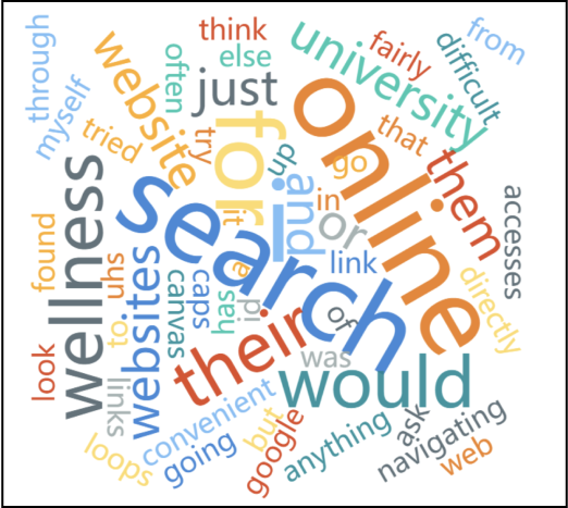
Word Cloud from Survey Responses
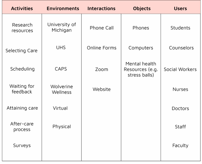
AEIOU

Eventually, we derived 3 insights from the research:

  1. Students who have previously accessed therapy and other care for their mental health prior to attending the University of Michigan are the most attentive and engaged when it comes to accessing services for their mental health. Students may feel a “stigma surrounding mental health”.

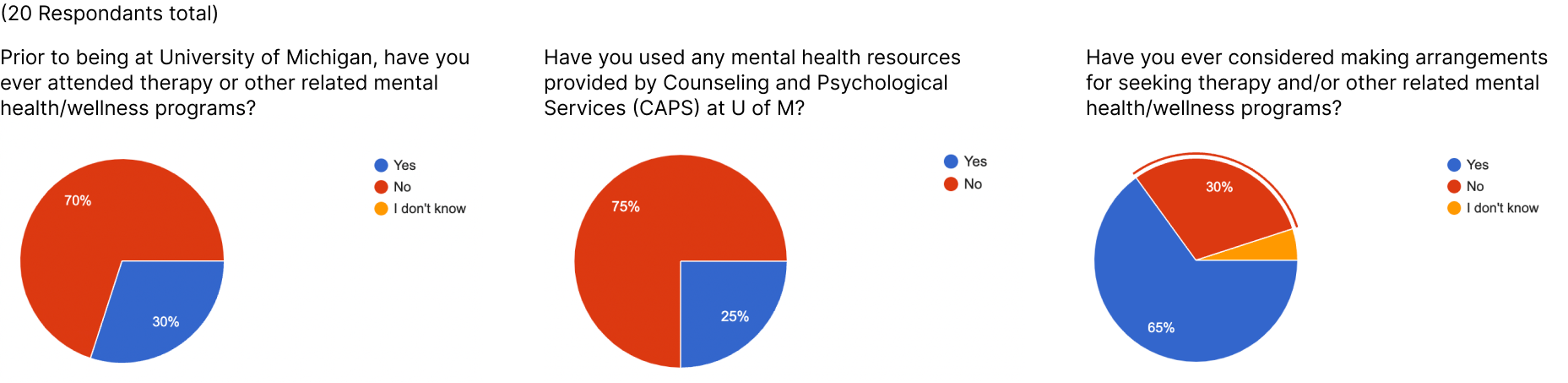
    Survey data of a few questions we asked


  2. The existing platforms to access UM mental health resources such as the websites CAPS and UHS are overwhelming for many users. Too many options to choose from.

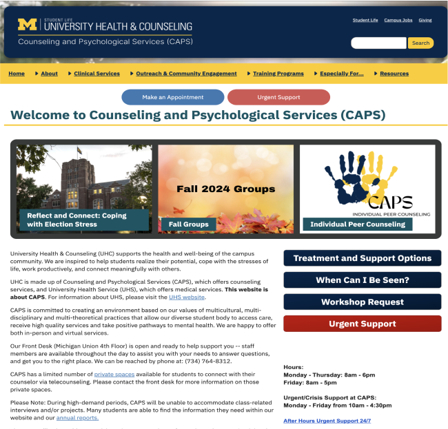
    CAPS Website Homepage

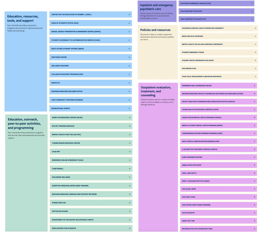
    Well-Being Collective Continuum of Care Resources


  3. CAPS may be the resource most widely known about & recommended, but there are many other resources available on campus available depending for a student's specific needs and situation.

Step 2: Define


At this stage of design, the previously diverged discovery cone needs to be converged to a single focus of design. In order to do this, we drew the user journey map to identify the part of the CAPS system that we want to improve, and marked it with an orange box.

Drag or swipe right to see more ->


After confirming the interactive system of focus for the project, which is the CAPS Initial Consultation Form, we fleshed out other proposals and narrowed our how-might-we question down to a more specific design inquiry:

How might we improve U-M students' experience accessing mental health services provided by Counseling and Psychological Services (CAPS) through re-designing its Initial Consultation form?

Step 3: Develop


In the development stage, the "cone" of design opens again - which means that we can start our design process, integrating more ideas into more versions of the prototype. So, in this period of time, we confirmed the position of improvement in the information architecture, improved the proposal, analyzed the current task flow, drew our versions of optimized task flows and a LOT of paper prototypes.

The information architecture is as follows, with the position of CAPS Initial Consultation Form settling in the orange box:


Our final project proposal has the following parts:

  • Value Statement: The initial consultation form redesign's purpose is to make the process of filling out the form less overwhelming, quicker to complete, and and more efficiently collect information that is targeted towards specific user groups' needs.

  • Pain Points: This redesign will make users less likely to give up on completing the form, thus getting them access to mental health services. The new form will have transparent steps and have less stress inducing questions.

  • Design Criteria:
    • Be easy to navigate for first time users.
    • Gather necessary information for the mental health professionals
    • Able to be completed in one sitting
    • Questions are worded in ways that won't confuse or stress users who are trying to use mental health services for the first time.
    • Less clinical and more interactive

  • Improved Access:
    • People seeking mental health resources for the first time
    • Stigmatized groups
    • People who already know what they may need

  • Implications:
    • Increase in consultation requests
    • CAPS providers more overwhelmed by case load
    • Connection of various university mental health resources

Then, we identified important touchpoints that their improvement improves the entire user experience. They are:


After extensive user testing and expert interviews, we also decided to change the sequence of the task flow to ensure the "two flows" ideology - placing mendatory parts in the first half, allowing a faster completion, and adding a chance for reviewing the information before submission:


By adapting these changes, our projected task flow takes at least 10 minutes less than the current form, and a shorter time of completion usually means lower drop-off rates.

Currrent flow
Improved flow

Step 4: Validate


From all the preliminary information and research, we developed and finalized the design of an entire flow of prototype for the new form, and to access it, please click the link below:

Final Prototype Walkthrough

Here is the design toolkit:


Here are the featured improvements of the interface:

Progress bar: We added a progress bar after testing out 4 varied versions and selected the most favorite and intuitive one:


Appointment Scheduling Page: As the current appointment scheduling page is a long list of long text, which is less intuitive, we developed a new set of appointment scheduling interfaces to address the issue:

Overall Improvements


Monthly View Panel Filters


Daily View Panel Improvements


Welcome & Review & Submit Page: We also added a more detailed welcome page and a new review & submit page for users to double check their input.

Review and Submit Pages


Other improvements and Additions: We also added a more detailed welcome page and a new review & submit page for users to double check their input.

Other additions