Project Image

My Cities:Skylines Gallery

Course: SI 339: Web Design, Development, and Accessibility

Professor: Jackie Wolf

Responsibilities:

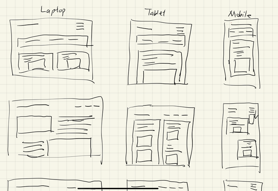
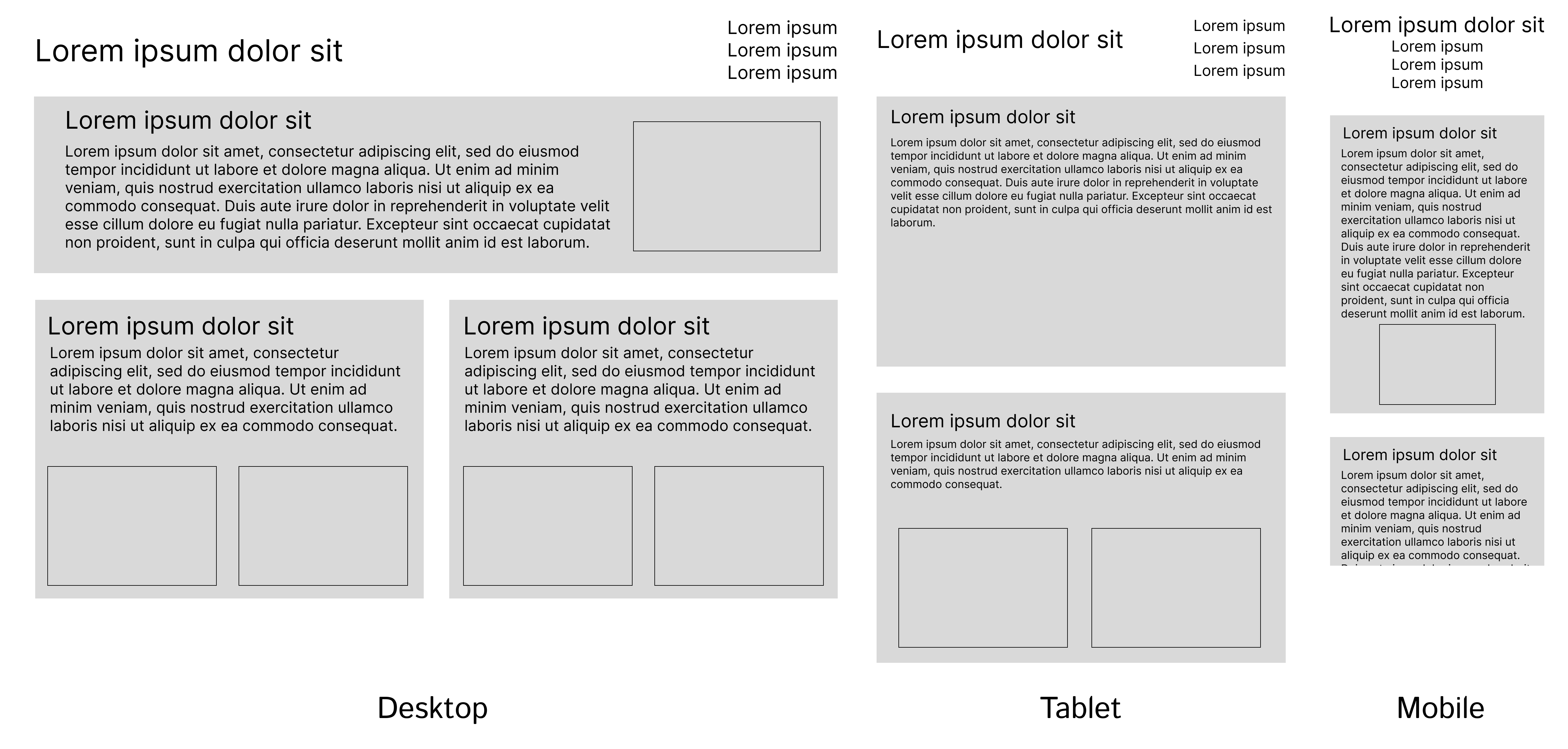
  • Wireframing Possibilities
  • Carrying out iterations of low-fidelity to high-fidelity prototypes
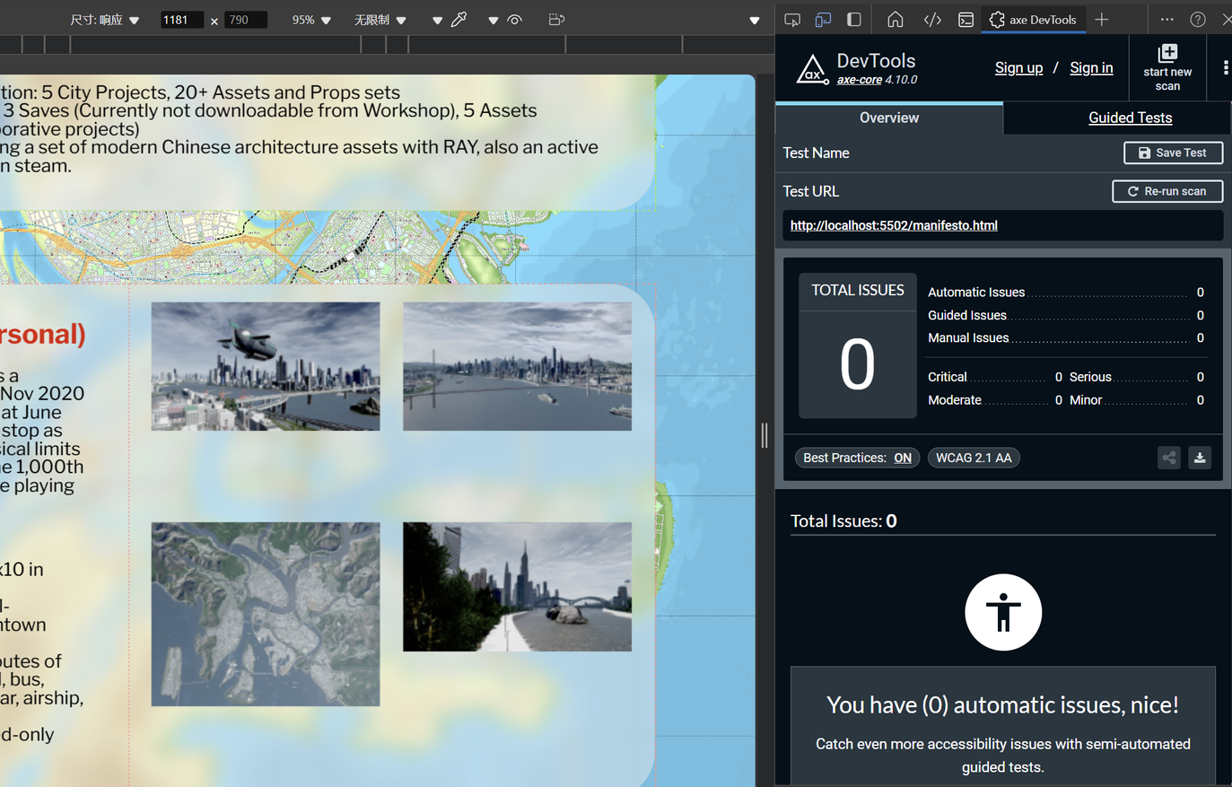
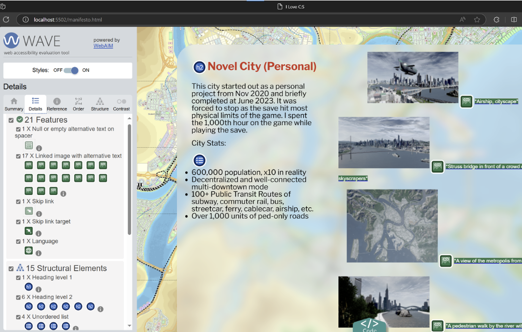
  • Choose color palettes according to WCAG standards
  • Perform user testing on website for readability and clarity

Tools and Skills:

  • User Experience Research (UXR)
  • User Experience Design (UXD)
  • Web Design and Development
  • HTML, CSS, JavaScript

This game gallery page is a responsive website with three versions for different screen sizes utilizing HTML and CSS. It aims to achieve a fluent task flow and leverages colors to make the website accessible (WCAG AA enforced) and easy to read. Also, it showcases my enthusiasm on the game and thoughts on urban design and planning.


Context


Cities: Skylines is undoubtly one of the most famous urban planning games that was ever made. Although the game works on a basis of a heavily criticized urban planning trend that was car-centric, single-type zoning, and an authoritarian socialpolitical portrait, it provides an escape from daily hassles with entertaining and fast-paced urban planning gameplay. So when this assignment comes up, I confirmed its topic without second thoughts.

Design - Wireframing, Prototyping, User Testing

Building a website from scratch is a simulation of the entire process of developing a product, so expanding visions towards multiple possibilities and narrowing down to one of them is important. In this self-guided process, I did a "Crazy 8" drafting of the responsive interface and developed a set of low-fidelity prototypes and showed them to people I know for feedback. After a few rounds of testing and iteration, the design for the responsive interface for the screen widths of laptop, tablet, and mobile phones are narrowed down to the image on the right.

Part of the Crazy 8 Drawing


The final set of prototype


Development - Accessibility Considerations


When coding the website, accessibility matters - give each image an alt text and trim color contrast between text and background is a necessity for those users relying on screen readers or suffering from color blindness. Before pushing the site to the Github repo, I always used WAVE Evaluation Tool and axe DevTools to check for possible accessibility errors.

Using Axe DevTools for accessibiliy and error check

Using WAVE for accessibility and error check

Links


Link to Website

Link to GitHub Repository


P. S. Feel free to reach out to me in the form in the "About Me" page and on social media!