CityLab Metrics: NYC Taxi Trip Visualization
Course: Creative Coding
Professor: Jonathan O. Schwartz
Group Member: Enzo Mignano
Responsibilities: Data Compression, Frontend Development
Tools: VS Code, HTML/CSS, JavaScript, D3.js, NYC Open Data

CityLab Metrics: NYC Taxi Trip Visualization
Course: Creative Coding
Professor: Jonathan O. Schwartz
Group Member: Enzo Mignano
Responsibilities: Data Compression, Frontend Development
Tools: VS Code, HTML/CSS, JavaScript, D3.js, NYC Open Data
In a megalopolis of 19 million people, how people move around is chaotic but vitally charming. The understanding of the logistics of the system brings new opportunities to improve the existing infrasturcture with time.
Step 1: Creating the HMW Question
At the very start of the project, we studied a few example databases and tried to generate HMW questions based on our observation and findings of the data. After these observations, we chose an area of focus as a help to guide our approach. Our group eventually decided that mobility is our focus.
Final HMW question: How might we be able to visualize how New Yorkers move around NYC?
Based on this question, we developed further research questions upon the context of our project:
How do people move around NYC?
What are the hotspots and patterns of the flow of traffic?
Our goal was to create a tool that is easy to use and informative about the urban space to the users.
Step 2: Creating The Database
The data sets chosen were NYC Yellow Taxi Trips 2018 and NYC District Zones. Both datasets were pulled from NYC Open Data. JavaScript and d3.js was used to merge the databases together. Below are the steps on how the files were merged to create the final database where our visualization pulls from:
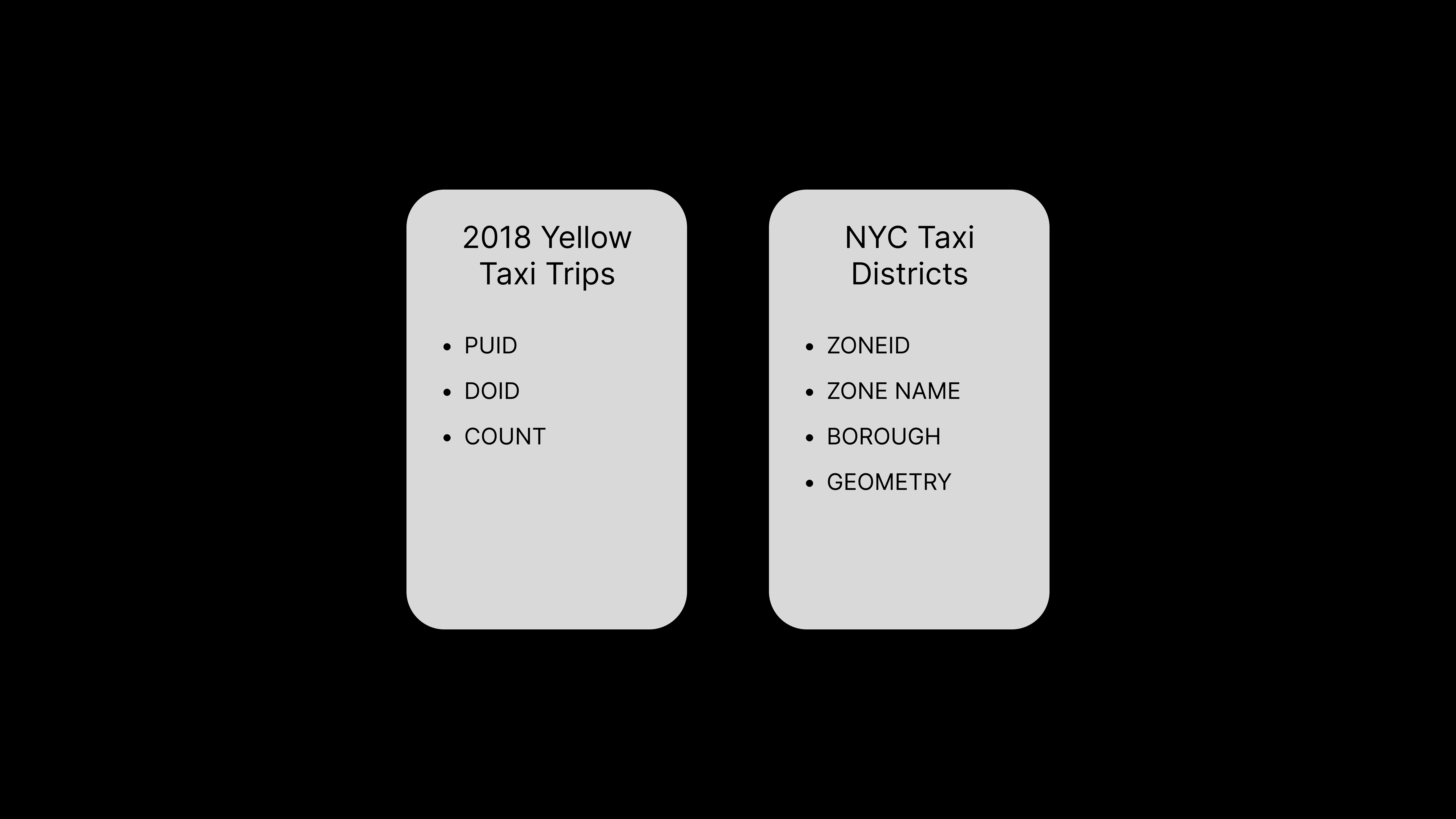
1. Original files and their content
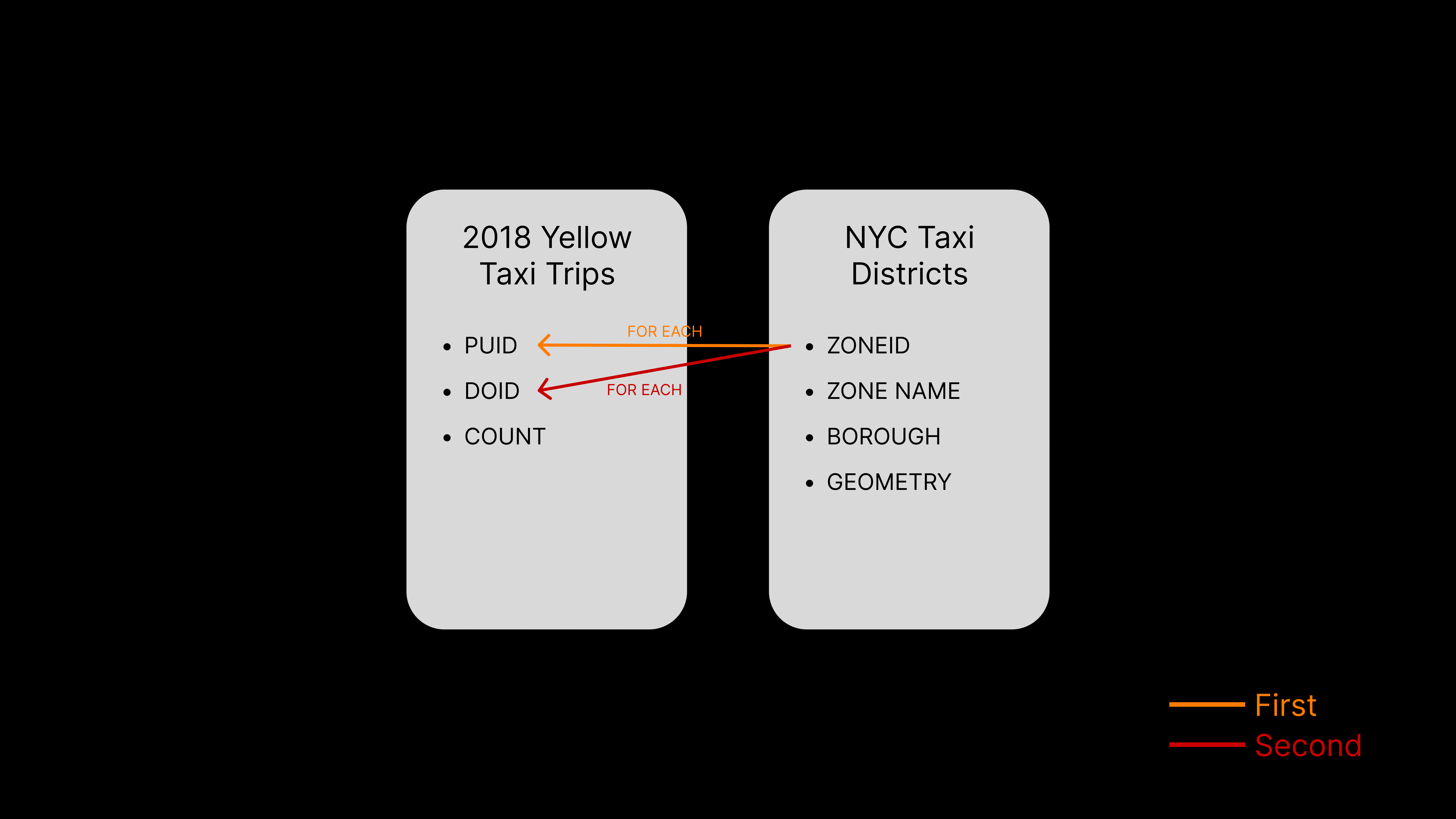
2. Matching the ZONEID data with the PUID (Pickup ID) and DOID (Dropoff ID)
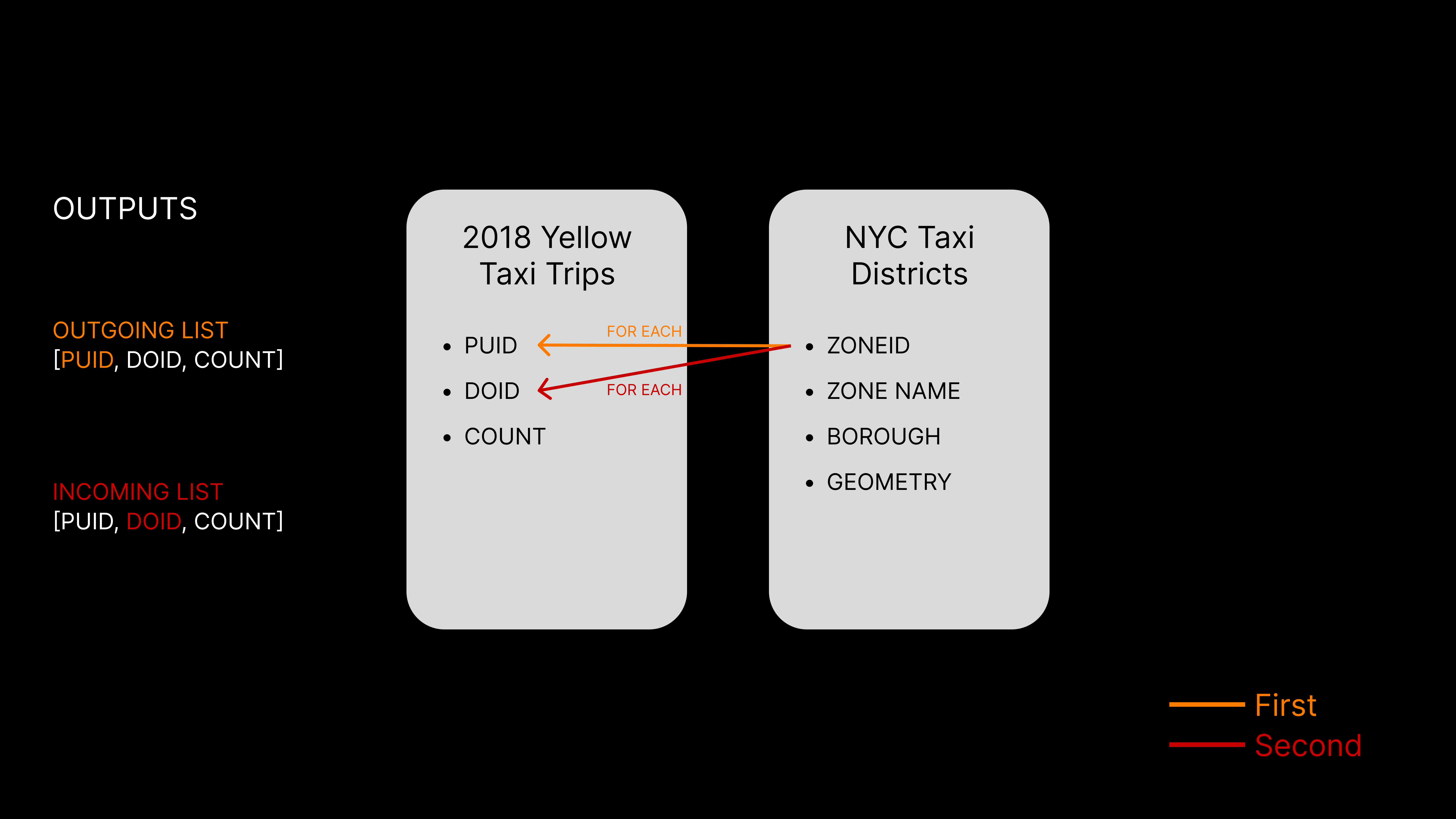
3. Creating an array of the information for each
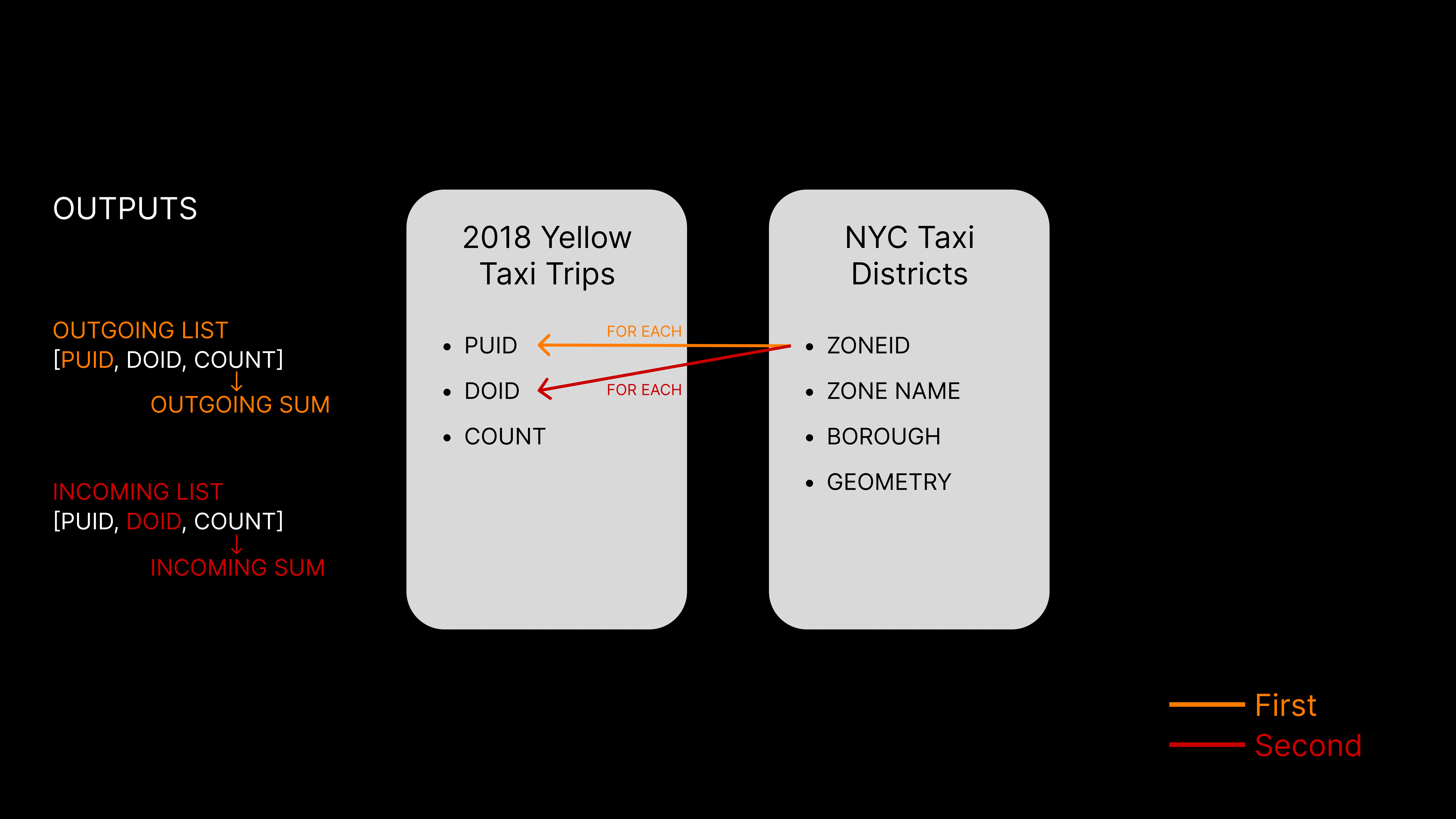
4. Calculating the sum after creating all arrays to speed up processing time
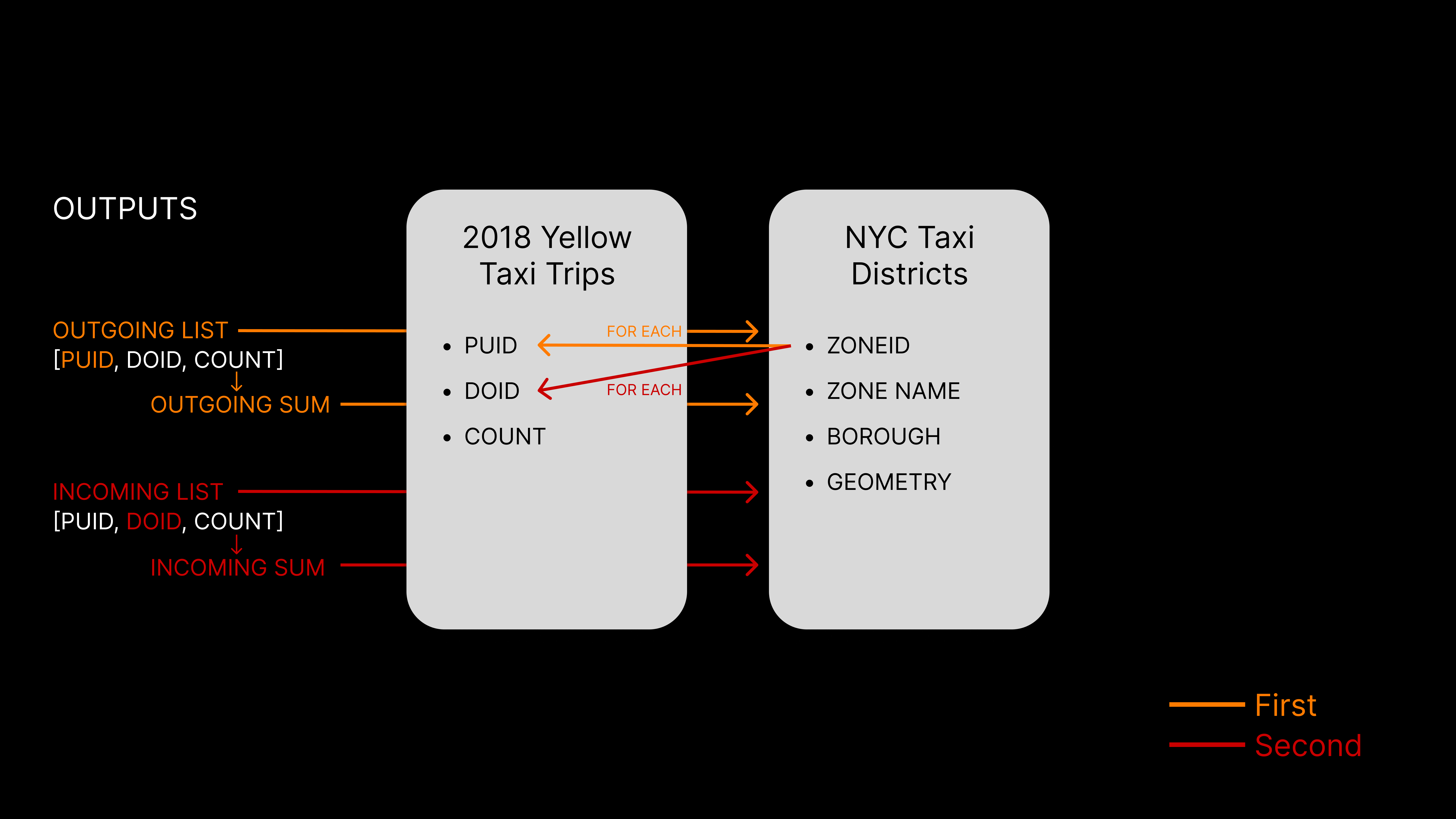
5. Adding the created array's and sums back into the Zone Map unter the ZONEID
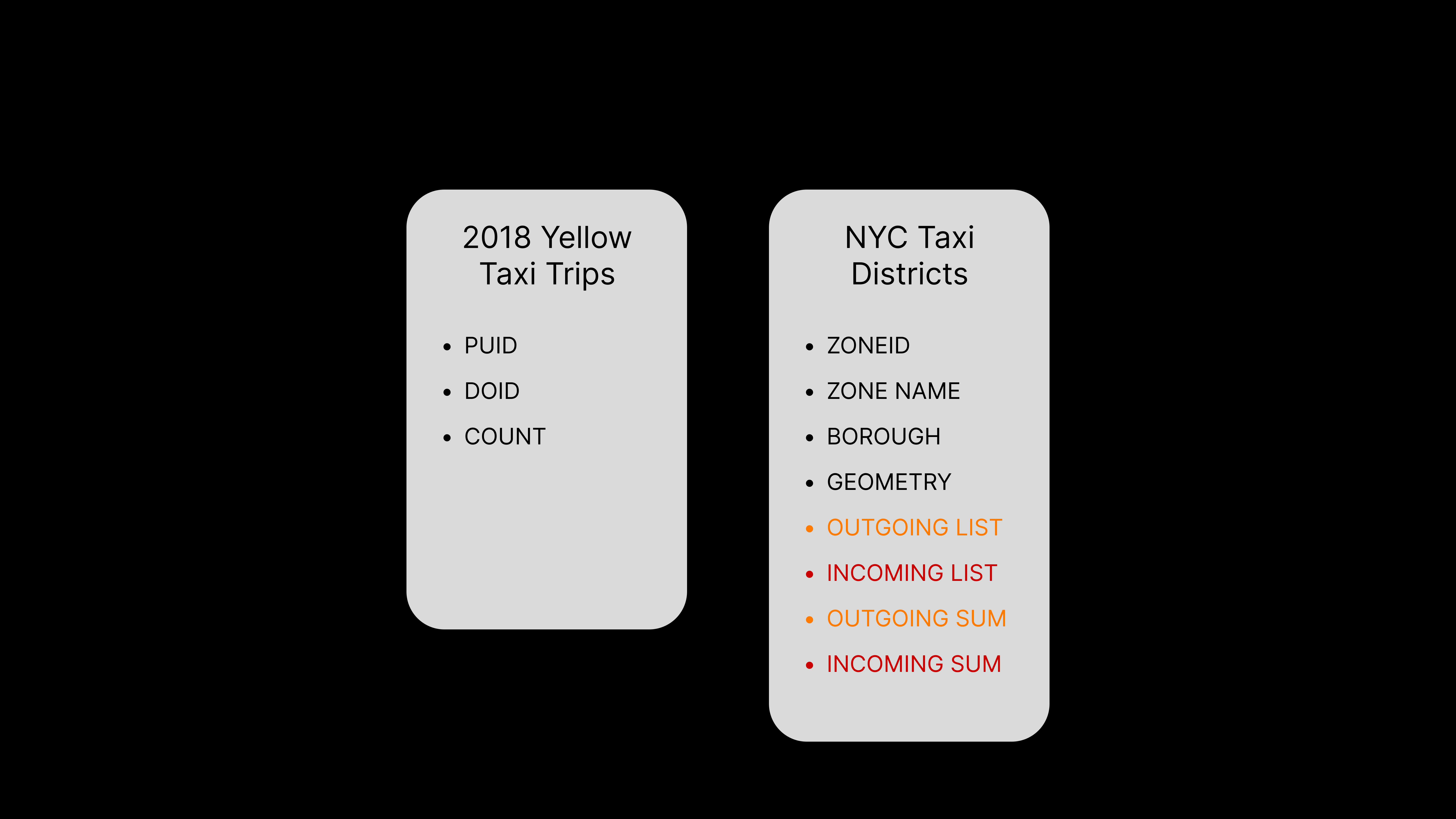
6. Naming the new information in the database
Step 3: Choosing The Visual Structure
During the ideation process, one of the challenges we encountered was deciding how to best visualize the data. Our goal was to create a map that was easy to interpret at a glance, revealing patterns on the surface while also allowing for more detailed exploration through user interaction.
We went through several iterations in pursuit of this goal. Using the Crazy 8 method, we prototyped various visualizations, including node networks, bar charts, 3D pillars, and bubble circles. However, we found that these approaches were either too complex for quickly identifying trends or too simplistic to support deeper analysis through interactions.
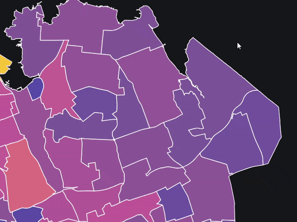
Ultimately, we settled on a Choropleth map for our final design. Since our data was location-based, and we were focused on tracking the movement of people across NYC, the Choropleth map offered the best solution. It provided a clear surface-level view of the data while allowing us to seamlessly integrate more interactive elements for further exploration.
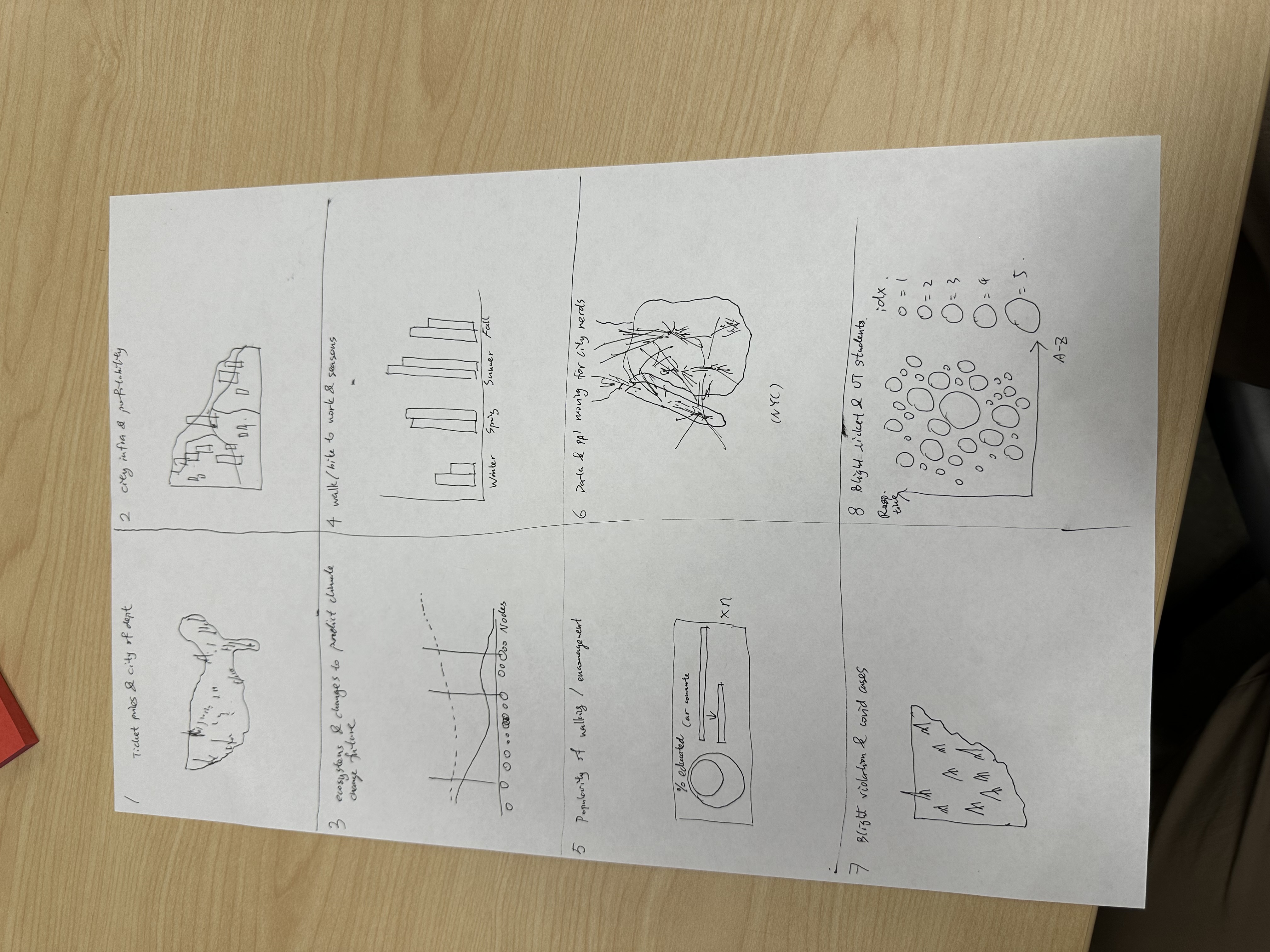
Ideation - Crazy 8
Step 4: Choosing Colors
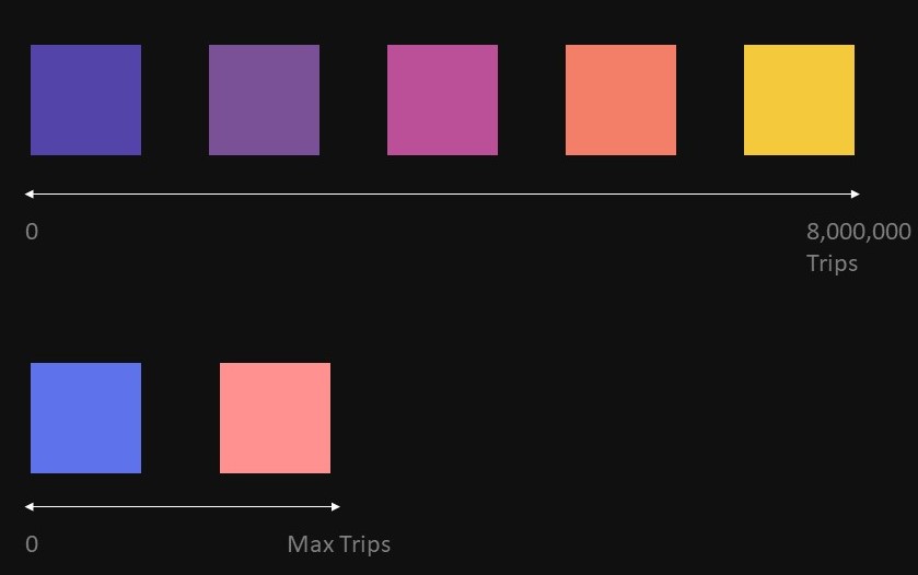
Choosing the right colors was a major consideration. Our major consideration is that there were two types of information - incoming and outgoing taxi trips that needs to be emphasized.
We chose our final color palette because:
The colors show the intensity of the data by using cooler colors for low traffic and warmer colors for high traffic, which is a perceptive norm of "temperature" as density.
Similar but different palette for two types of data indicates the relationship while keeping them separate.
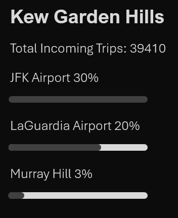
Step 5: Creating the Tooltip
Our tooltip is an interaction element implemented to give further details on data of different districts. We placed the tooltip on the side of the map to make sure it does not cover any important information, and the location is consistent at any states to restrain eye movement. Only the top 3 districts that has the highest amount of traffic is shown to keep it concise.
Clicking and hovering mechanism are also integrated into the final interaction.
Clicking: Changing information between incoming and outgoing traffic. Color palette is also changed.
Hovering: Highlights the hovered district and display the tooltip.
Conclusion: Compromises and Future Changes
We were only allowed a month of work time to finish this project - which is way too short to fully implement everything we want to do. As a result, we had to compromise a few features when prioritizing certain features over the other to create an interactive map where user follows a story line.
We still plan on editing this project in the future in the following aspects:
Better Zoom feature - user can zoom in at our current version but it is a little wonky
Optimized tooltip feature - the current one has a ~0.5s delay to find and display the data
Click changes legend when switching from outgoing to incoming
Add a year slider for the user to see information in a time span